
UX mise-en-place
My two-step recipe for ironing out details before attempting any visuals

Gathering details and putting them into place before we start designing
The first step in my design process involves no layouts at all.
It’s a list 😎
This process is helpful for long-form screens with a lot of content that needs to be prioritized, organized, and sorted. Maybe it’d be an interesting exercise for non-scrolling layouts, too. Doing this reduces the number of changes needed down the road and makes for much smoother implementation with fewer iteration cycles.
Step 1 - Assembling the list
There are usually bits and pieces of things that haven’t been explicitly documented or spec’d yet. It’s the role of a visual or UX designer to capture all of these details and figure out how to display them. Then, these details inform the shapes, colours, and sizes that each element will ultimately take on.
Some questions that I typically ask:
What data are we showing on each screen of a flow?
Minimum and maximum characters/digits?
How many of each element will we display, and is there a maximum?
Is there an empty state?
What is the most important thing on the screen?
What does the user need to accomplish?
What are the least important elements?
Which existing components should we use?
What happens to each element when you interact with it?
Step 2 - Arranging the list
I love paper, but I can’t be bothered with making paper prototypes, ever. This technique might have been easier with paper in the days of yore, but I prefer using auto-layout features to mess around with the order of things in long-form layouts.
I ask designers on my team to employ this process, too, because it makes for a great checkpoint for review with developers and product people. It’s basically a time-saving communication device.
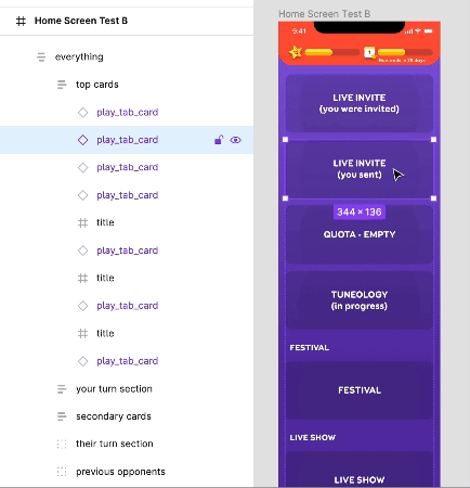
An example is this re-design of the SongPop (mobile music trivia game) home screen, below. In Figma, I listed everything we could possibly think of and colour-coded each item for quick reference. A vertical auto-layout container means you can drag items around until you get an ordering that everyone is happy with.
After this is somewhat established, the layout can start to literally take shape (and size). If asset sizes are flexible or still unknown, I make everything the same size to start.
In this example, I’ve added existing UI elements that won’t be updated, but re-designed ones are grey boxes. UI may still want to be rearranged, as some things will look different when they change size or colour.
Now the UI design can begin. This is when I add more states and play around more with showing/hiding things depending on what the user is doing, and rearrange again if we need to. At this stage, the amount of real estate that something ends up occupying could affect some of the ordering, but the architecture is still flexible.
This process is like an inverted cone (a funnel, maybe). At the top where it’s the widest, the most ground is covered. With each sweep, details are added in baby steps. The closer you get to the bottom, the more honed in you are to the end product. Theoretically, you do away with large, sweeping changes towards the end!