
Case Studies and Methods
A deep dive into how I like to work

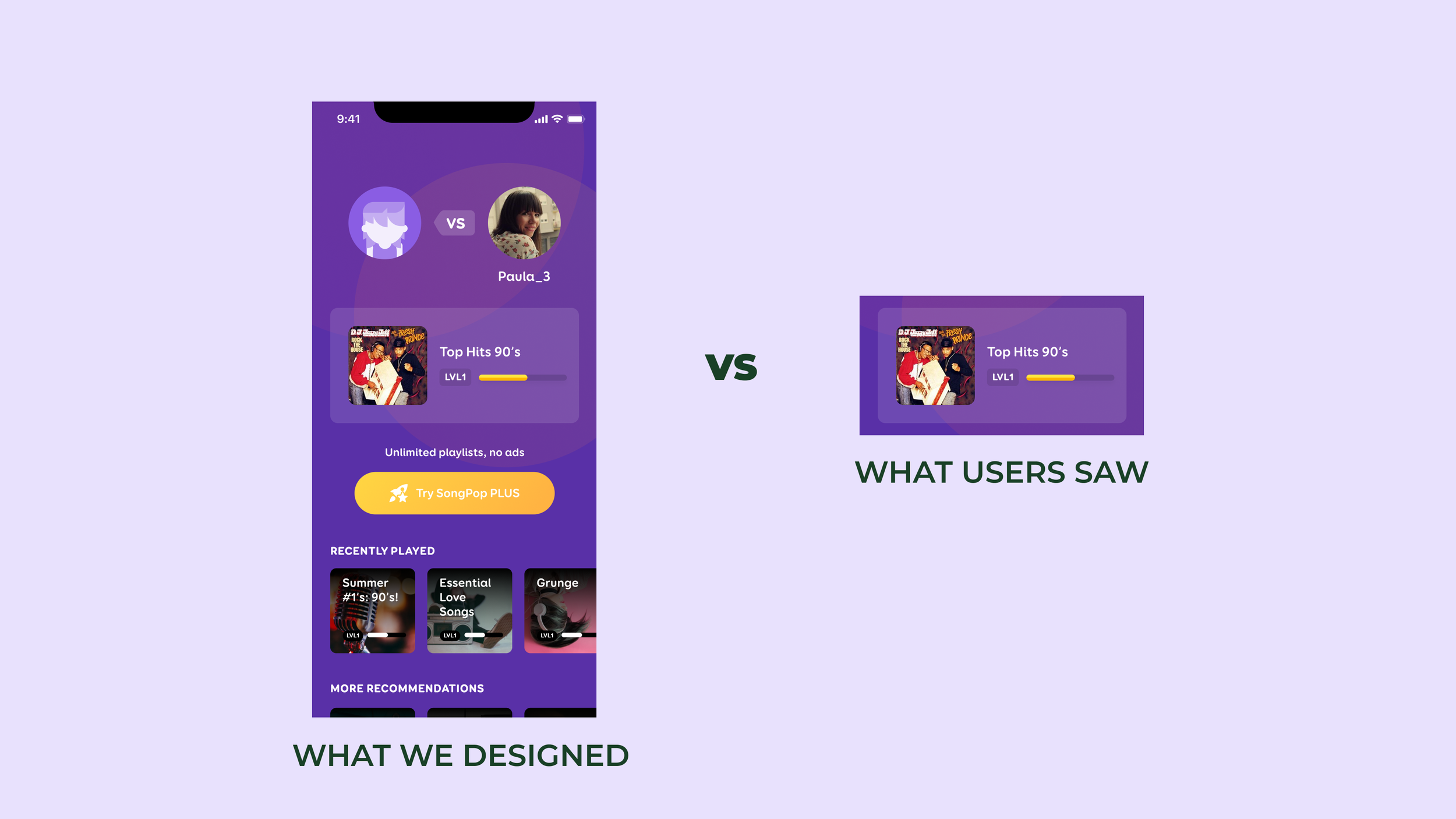
Merging multiple subscriptions across two apps into one
Tackling the complexities of migrating 6 different user segments to a new subscription plan
A/B testing better ways for new users to discover playlists
User testing revealed that newcomers had no idea how much our music library had to offer

Visibility of system status in real-time interactions
Drilling down into this heuristic to stop frustrated users from canceling live sessions

Prototyping several modes of user inputs for a single feature
Contending with touch inputs on mobile, directional game controllers, and keyboard interactions

Player profiles as a gameplay tool
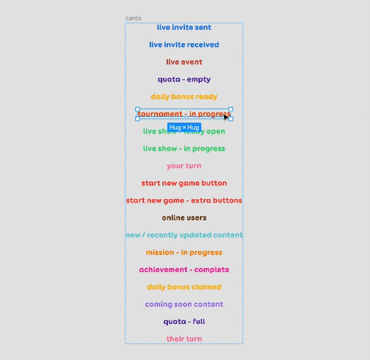
Hierarchical improvements and performance optimizations on the player profile, a popular screen in our trivia game.

Employing Value Chains to center the user
Player motivations as a focal point for creating meaningful economic flows and interactions
UX mise-en-place
My two-step recipe for ironing out details before attempting any visuals

Hand-off checklists are essential to the definition of done
Eliminating pain points when designs are implemented means we all do better work more efficiently

Democratizing design feedback loops for the whole team
Figma provides ample opportunity to annotate and redline, but an external blog facilitates more discussion
Resources for delightful, rewarding experiences
Resources and philosophies that have shaped my game and product design practice over the years.

8 ways leaders delegate successfully
The one Harvard Business Review article I’ve sent to everyone and keep revisiting over and over

The case for lo-fi wireframes and concepts
A story about the parallels between managing stakeholders and stoking IC creativity

Dodging cognitive biases in decision making
Removing subjectivity in team brainstorming, user research, and user testing analysis.

How spreadsheets became one of my essential design tools
Be lazy: Photoshop, Figma, XD, and so many others let you pipe data directly into your layouts

How I use Luminosity to assess colour contrast
A cool trick I learned to quickly determine if there’s enough contrast in a screen design

A quick primer on why gradients suck sometimes
Eliminating the muddy grey/brown areas because conventional colour spaces aren’t perceptually uniform

Sizing icons to feel at home inline with text
My guidelines for setting the size of icons and emojis like glyphs of a typeface

How I set up notification badges in Figma to expand with more digits
One of my favourite, most satisfying ways to use auto-layout for tiny things