The Survey
Since 2018 the Alliance of Freelance Cartographers (Daniel Huffman and Aly Ollivierre) has conducted their annual survey to foster transparency amongst freelance mapmakers across the profession. Year after year, they’ve helped cartographers around the world to better understand the marketplace.
For 2026 they needed someone to take on the analysis and charts as they were both quite busy. I was happy to help them showcase the results and I took it as an opportunity to learn more about a profession that I’m deeply interested in.
The Process
I studied the results of all six survey years to get a full picture of how they typically go about the analysis. I created my own shorthand for understanding the question categories, then cleaned and formatted the data to analyze using R.
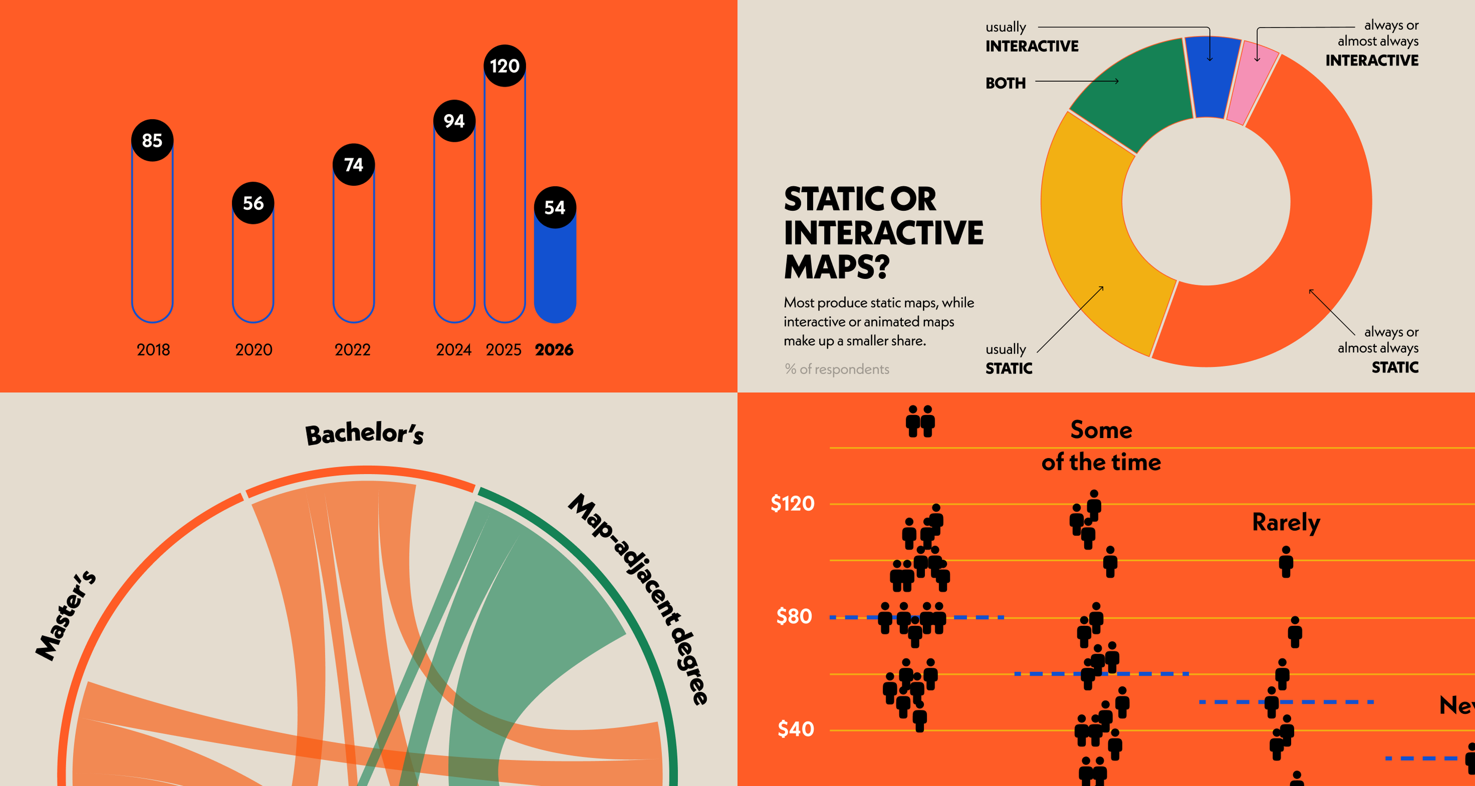
Daniel mentioned that they were open to a different graphic style if I was so inclined, but I felt it made sense to go for a similar look to previous years. As usual, I couldn’t help but add a slew of bold colours and I snuck in an updated version of the typeface: Neue Kabel.
I used my favourite Figma Slides template ‘Modernist Signal’ to put it all together since Daniel will be presenting it the results at the NACIS annual meeting in October 2026. I developed my own visual system for all the custom charts, inspired by the template’s aesthetic.
Demographics
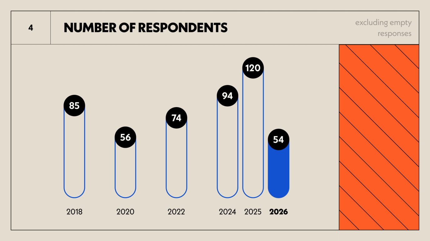
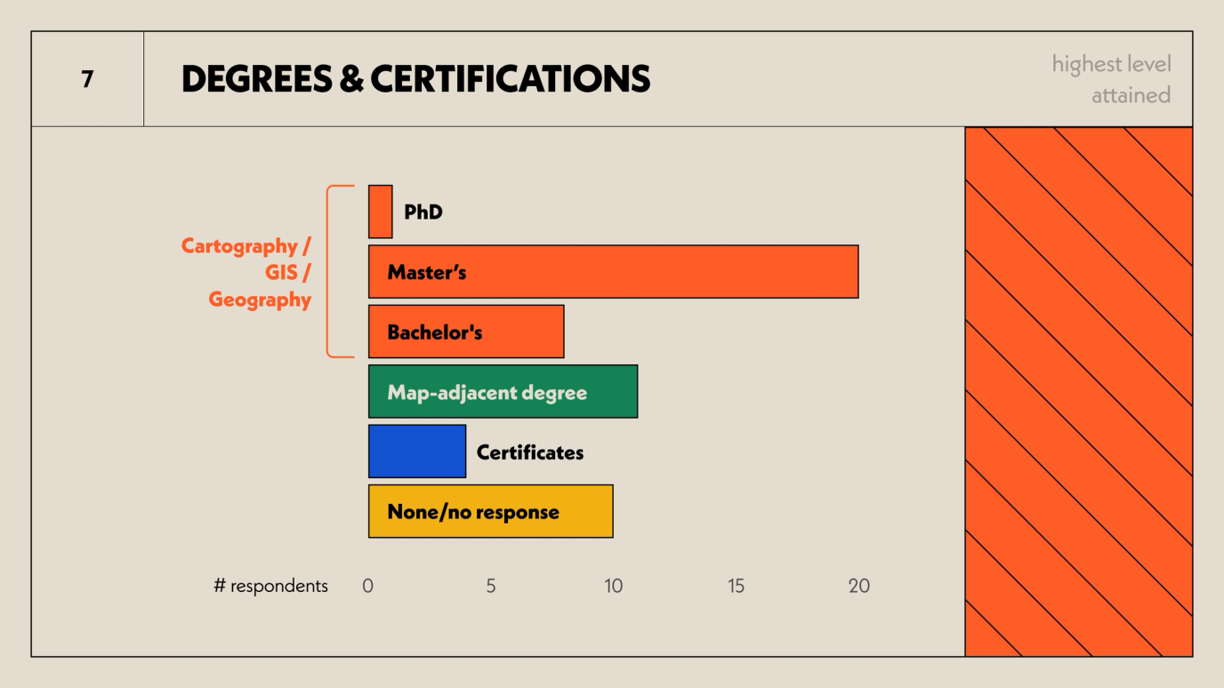
The respondents seem to be a pretty educated bunch.
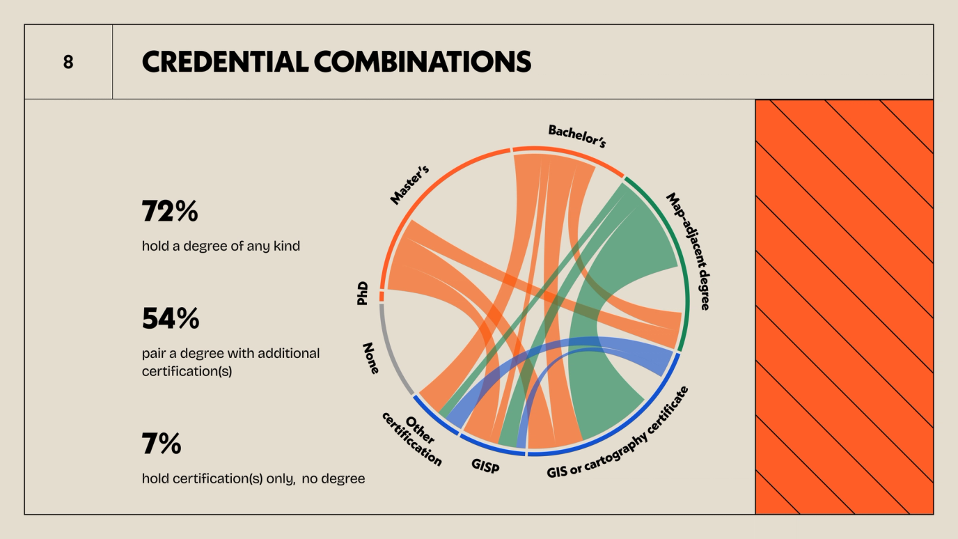
I was interested to see if degrees and non-degree credentials overlapped, and they definitely do. And as someone who doesn’t have a geography degree I wanted to see how I measure up. I’d say my own degree is only somewhat related (data vis), but I do have a certificate in spatial analysis. If I had taken the survey I would not have been an outlier.
Freelance Rates
I was really hoping to get a good picture of gender differences in rates, if any. But there weren’t really enough respondents to get a statistically significant result. I had the same problem analyzing rates against years of experience. I ran Spearman’s rho correlation tests to reveal which results were significant enough to include in the presentation.
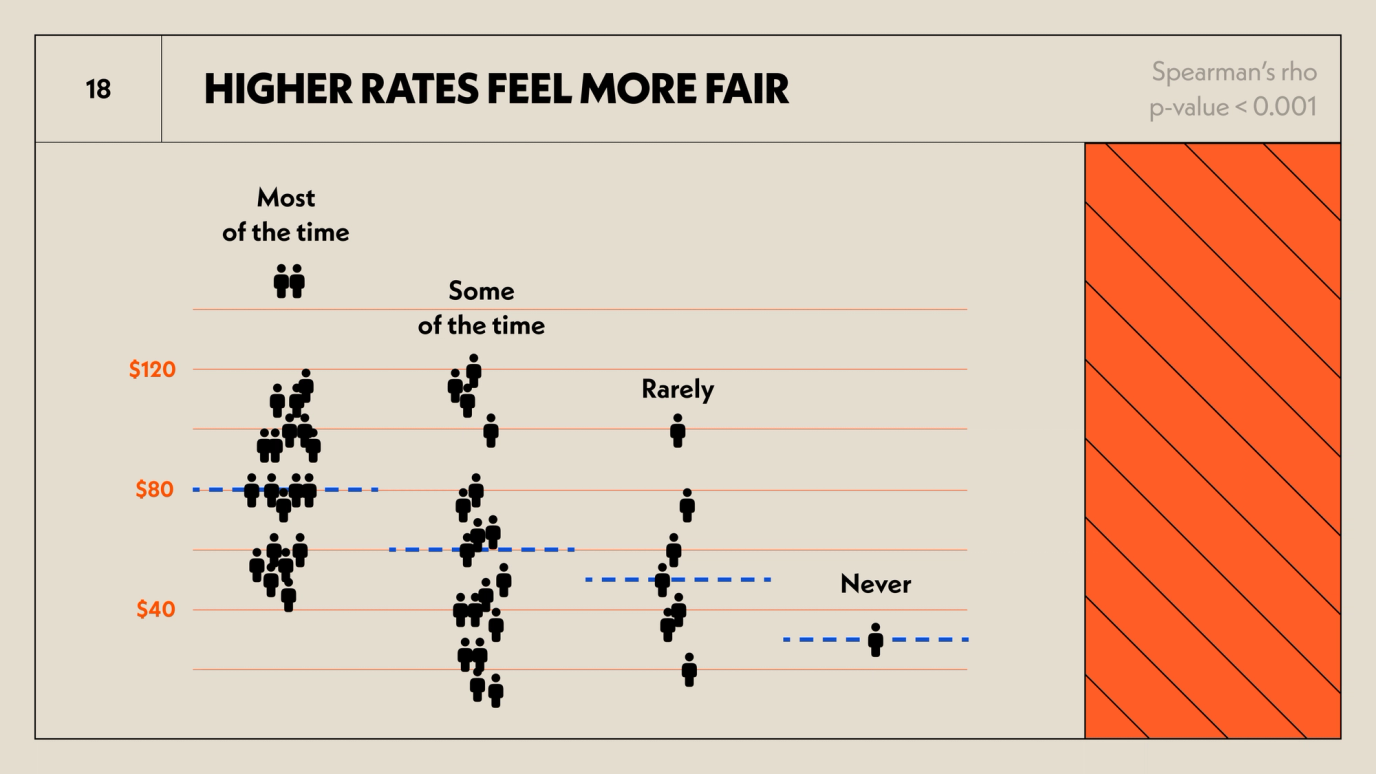
Not surprisingly, those who get paid more feel more fairly paid. However, the spread is wide within each category of answers, and the relationship only moderately significant with a rho value of 0.46.
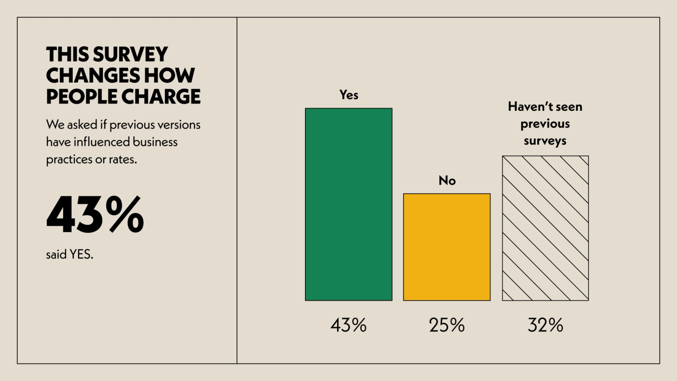
What I love about this survey is that the community finds it to be a very useful resource. Every year, a lot of respondents say that the survey has changed influenced their rates or business practices.
The Projects
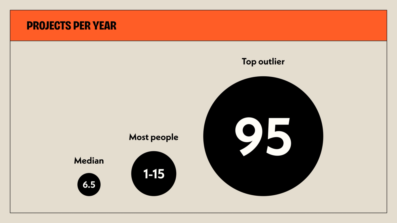
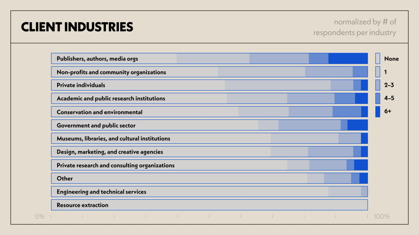
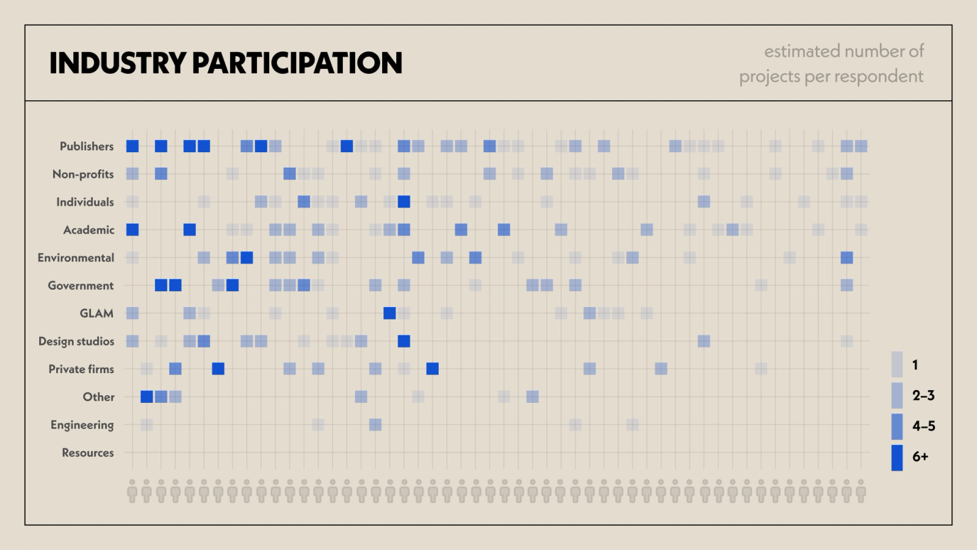
Questions particular to this year’s survey revolved around the types of projects people do, the industries in which they work, and the typical volume of projects per person.
Clients and Industries
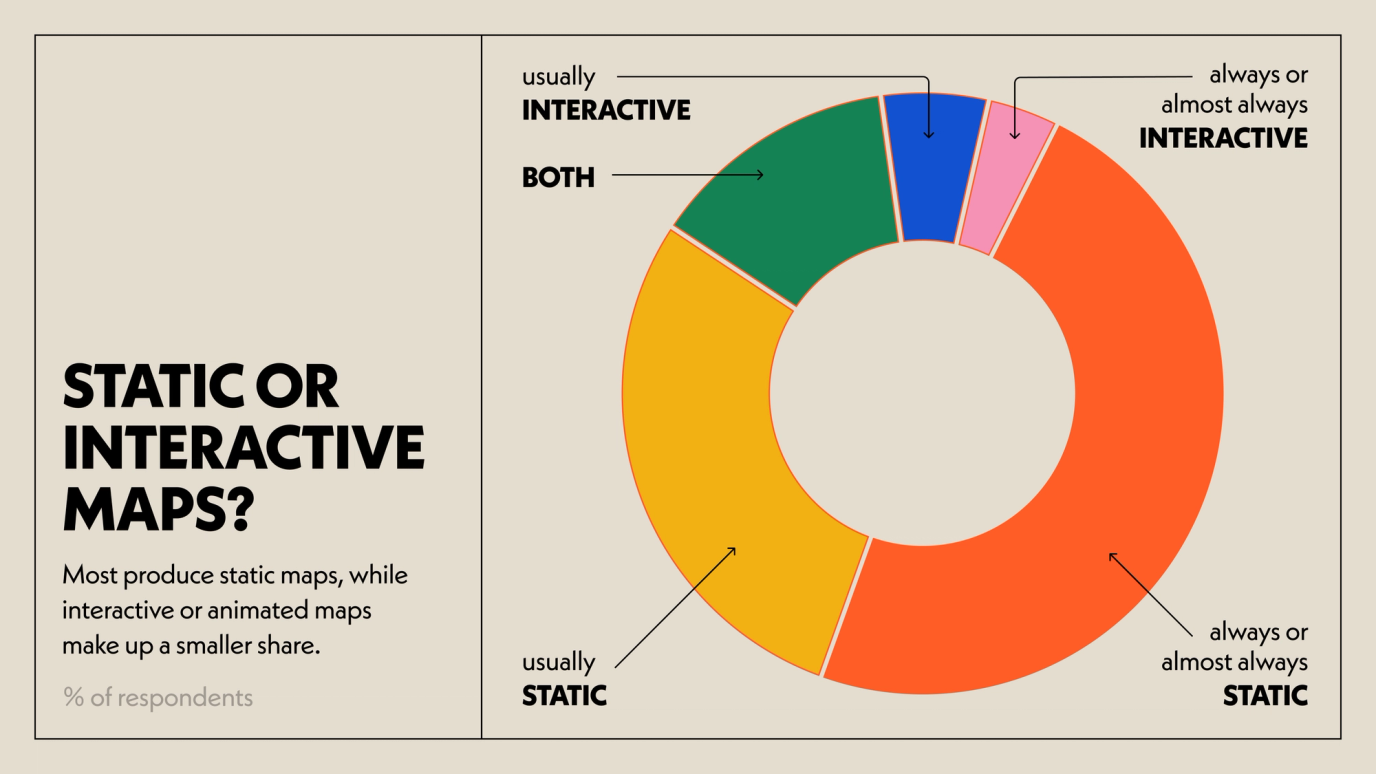
I visualized this section in two slightly different ways. The survey asked people to pick a range when it came to the number of projects, not to provide an exact number. These charts only estimate how much respondents participate in various industries.
Thanks
The community is always grateful that Daniel and Aly put this survey together each time. I’m looking forward to seeing next year’s!